We have so much information at our fingertips that we do not know what to do with it. Visualizing your data does way more than just show you the information you have; if done right it can identify new patterns never seen with flat reports. Additionally, by using interactive representations of your information you can communicate much more in a fraction of the time than with traditional reports.
In shipbuilding and offshore there is much more emphasis on using the latest technology to better distill and understand the data we generate. There are many ways we can visually represent our data but the most familiar is with bar graphs and pie charts. These types of visual reports are extremely beneficial and help us make good business decisions every day. However, with a significant amount of our data related to physical 3D objects and fourth (time) and fifth (cost) dimensions, these types of reports are not always the best way to present information.
With all the technology we have at our disposal I struggle to understand why more organizations are not creating visually interactive representations of their information. We have the information, we have the tools and we have the skills. Investing a relatively small amount of time to create these informational representations of the data we use or want to use in our decision making should be a no brainer.
Interactive representations of the data will benefit the users generating the information as well as the stakeholders who are not experts in the source authoring tool.
Previous examples of Interactive visualizations
In my previous blog posts I have demonstrated several ways our clients are creating very information rich and interactive reports.
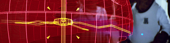
Do you know the status of your welds?
Skip to 1m 30sec
Trying to read pages and pages of weld reports to get an idea of how your projects welds are progressing either in design or on the waterfront is very time consuming and error prone.
By using a method to visually see the 3D weld in your project and the associative properties can significantly decrease the amount of time it takes to understand the current (real time) state of your welds.
With a quick scan anyone can see problem areas and very quickly take appropriate actions to resolve the issue.
Connecting engineering and production planning
Skip to 9m 15sec
Trying to understand the build sequence of your project by reading the product hierarchy tree requires a lot of skill and knowledge of the project.
By creating an interactive 4D simulation of your project which incorporates:
- Project breakdown structure
- 3D model
- Planning schedule
…you can communicate your build sequence to absolutely anyone in your organization without any requirement for understanding any of the authoring tools.
This also is a great illustration for production reviews between the engineering and production team. Issues can be identified very quickly as well as fixed in the meeting.
A solution for a distributed team using disparate CAD authoring tools
Skip to 44sec
The reality is there are always going to be issues with your design that will multiply with a distributed team. The goal is to identify them as early as possible and communicate them effectively to all stakeholders.
Creating markups, views and comments associated to the source context (3D model) is the most efficient way of sharing your thoughts.
You want more examples? Ok, here they are
Above are just the examples in some of my previous blog post but there are many more ways to represent your data in a format which can communicate information very efficiently. Some recent examples where I helped clients create illustrative representations of their data are:
Illustrate which parts are already purchased and nested
This was to solve the problem where the client wanted to know the cost of a change. We all know that if a change effects parts which are already purchased or already CNC cut that the cost of the change skyrockets. They wanted to see this change in a visual representation of the 3D product model. With the solution I provided, any user, even the non CAD users, were able to easily see the current state of their project and better estimate and communicate the cost of the change to their client.
Visually show what parts have changed in the last day, week and/or month
This was needed by the client so they could better understand how their project is progressing and identify issues early. This was complimentary to some reports but provided the client a very easy, quick, accurate and up-to-date method to see how their engineering team was progressing. This visual model can also be used in weekly management meetings where the executives are now not required to read pages and pages of reports to get a sense of how the project is progressing.
Closing Remarks
Having good representations of your data will simply communicate information quickly, accurately and will not require additional knowledge of the project. Using 2D reports are still required and will continue to have a place in representing information but when illustrating data that has another dimension (3D geometry, time, cost, etc.) using a more modern way of presenting the information will allow faster and better decisions.
Every single organization is looking at ways to make better decisions which is why I think that we should make sure we take the time to see how we can improve how we represent the information we already have with the tools we already have.
A good interactive and visual illustration of our data is worth a 1000 2D reports 😎